Asymmetry in Design
When creating a product or a piece of art creating symmetry seems like the main goal, however it’s not always so.
Our aim when creating something aesthetic is to have a cultured balance to it, that is when I look at it the creation puts the viewer at ease or in certain cases is intrigued by it. Considering all of this our natural choice is to make it symmetric, we know human eye finds symmetry pleasing we can see it in all symbols of beauty may it be a butterfly, a bird or even a simple fruit like apple.
Looking at the wonders of symmetry one might think that asymmetry is anaesthetic or ugly to look at but that is not the case, we can observe this in our body too where the heart is tilted towards the left and the left lung is slightly smaller than the right one to accommodate it.
So we realise true aesthetics are made of both symmetry and asymmetry,in any order but the creation should have a visual balance.
We can look below is an example of symmetric balance:
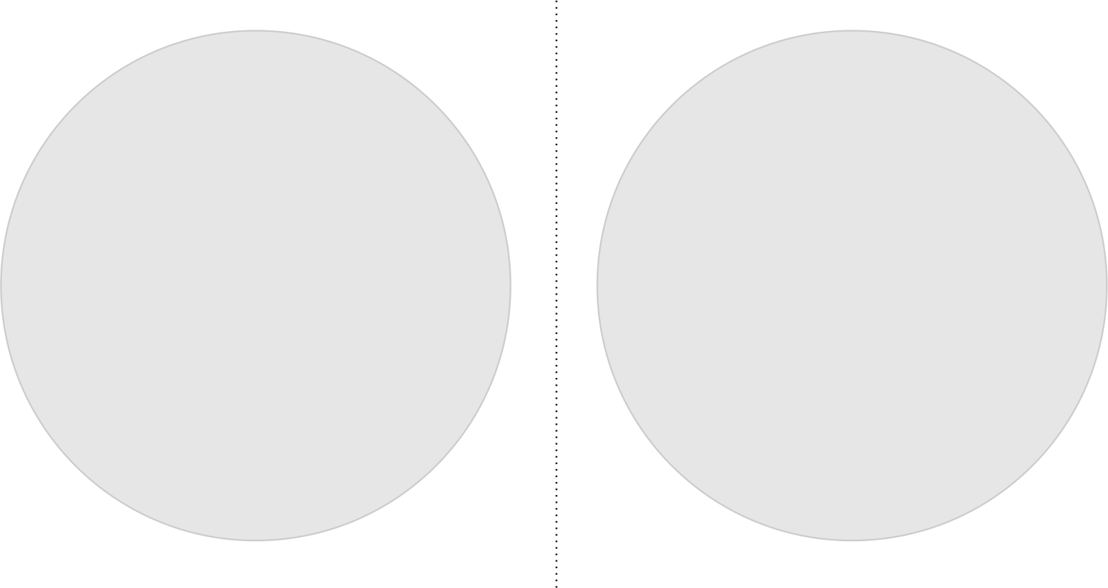
The composition is very simple,aesthetic,visually appealing but very boring!
This is because the human brain can easily predict the other half of it, losing all the intrigue and excitement.
Now have a look at the composition below, this is an example of asymmetric balance, where different elements balance each other out.
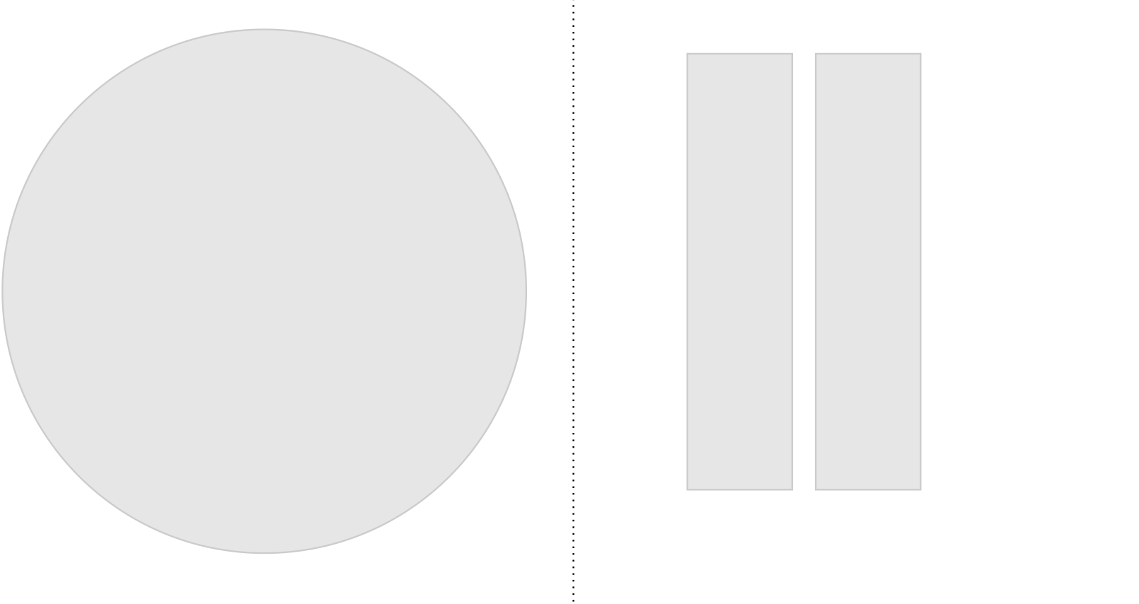
Despite asymmetry we find this appealing as our eyes move back and forth between the elements catching us in intrigue.
This is the power of asymmetry.
Another example of this design trend can be seen at Mannan Impex where the interior lighting has a asymmetric casing, everyone who enters notices it the first and always stops to talk about it.